When it comes to user experience, I'm a big fan of consistent design, which gives users confidence that their actions will lead to an expected outcome. When users know what to expect, they are open to experimentations; they are not afraid to explore wider set of features, and try out new capabilities.
When there's no consistency, when the same function gets different names or labels, or when it shows in different places, then users get confused. And when users get confused, they're reluctant to try anything that's not within their immediate need. Here's an example for such confusion, which I've just experienced on my iPhone, when trying to share an image with a friend.
That's the flow I went through:
- Took a screenshot on my iPhone
- Went to the iOS photos app
- Selected the screenshot I've just taken
- Clicked the share icon
- Selected to share via Messages
- Selected the friend I wanted to share the screenshot with
- Clicked send
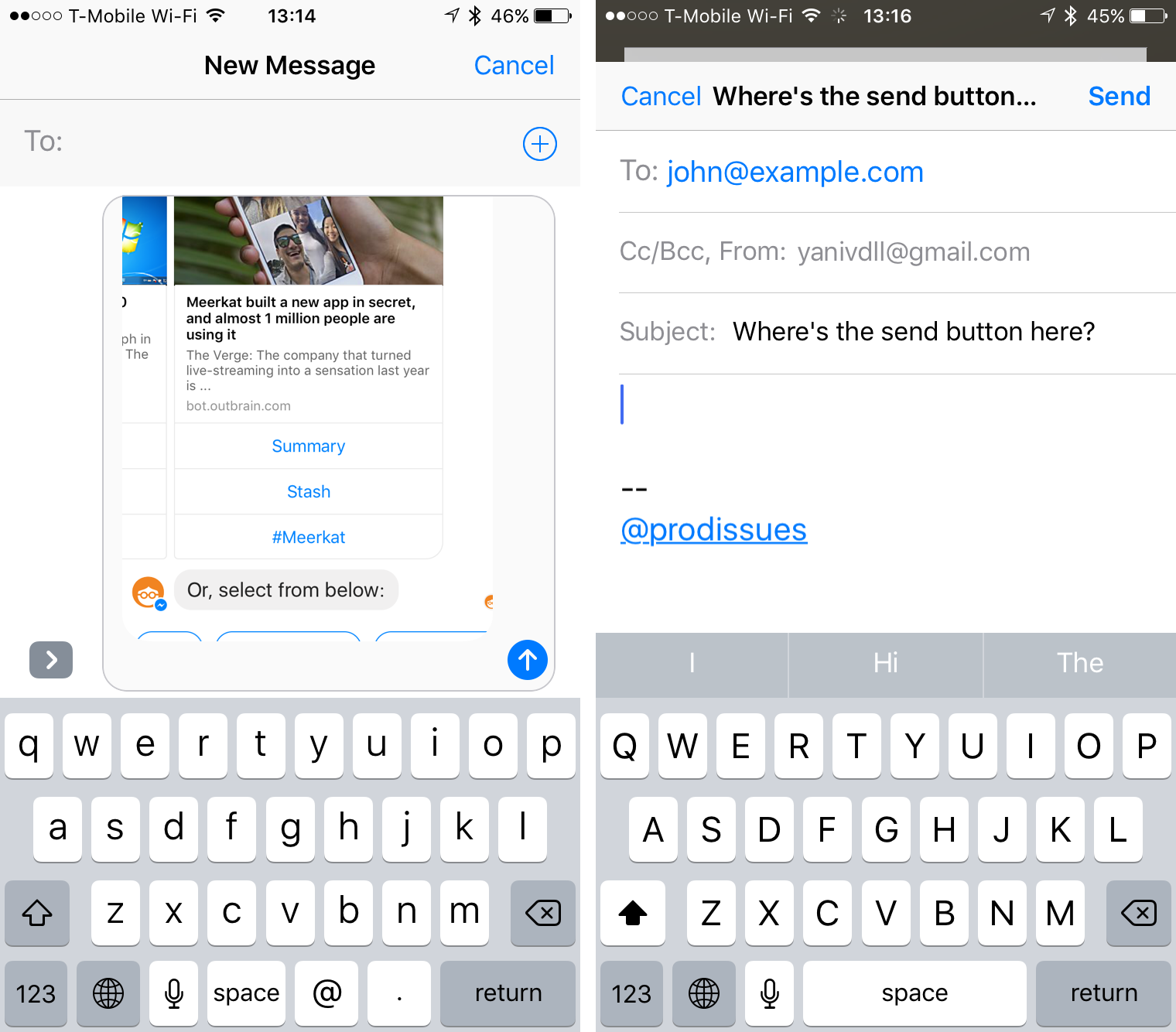
Or have I...? when I clicked what I thought was send, the Messages' screen closed, leaving me wondering if the image was actually sent. I repeated the flow, and just before clicking the "send" button1 paused to read its label. Hmm... it says "cancel". That's weird. I'm pretty sure it should say "send". But what made me think that that's where the "send" button is? was there another app that primed me with this expectation?
There is, off course. It's called Mail.
In Mail, the send button dominates the top-right corner of the screen. Now, since I send too many emails every day, way more than I share photos, my brain expect the "send" button, in whatever app I'm in, to show at the top-right.

Figure 1: To the left is the Messages. On the right - the Mail app. Note the different buttons on the top-right corner of each of those apps.
I love those moment of self awareness, which allow me to test some of my own assumptions...
-
It's a little hard for me to call it button, because nothing make it stand out from its background, like you would have expect a button. Is it possible that my brains is still wired in the pseudo physical, skeuomorphism, design...? ↩